
Good SEO is about being honest and being real.
I believe this because I believe people relate to websites and brands in the same way they relate to other people. People want to feel they can trust you, they want to feel you care about them (especially if you’re asking them to give you money), and they want enjoyable measured doses of exposure to you.
These feelings and desires apply to websites as well.
SEO is not science, at least not in the way some companies sell it
Search optimisation bears much similarity to social etiquette. While you can expect a few norms, you also find many unknowns, variables and factors beyond your control. Just as how taboos today may be acceptable tomorrow, what your SEO agency implements for you could become irrelevant overnight.
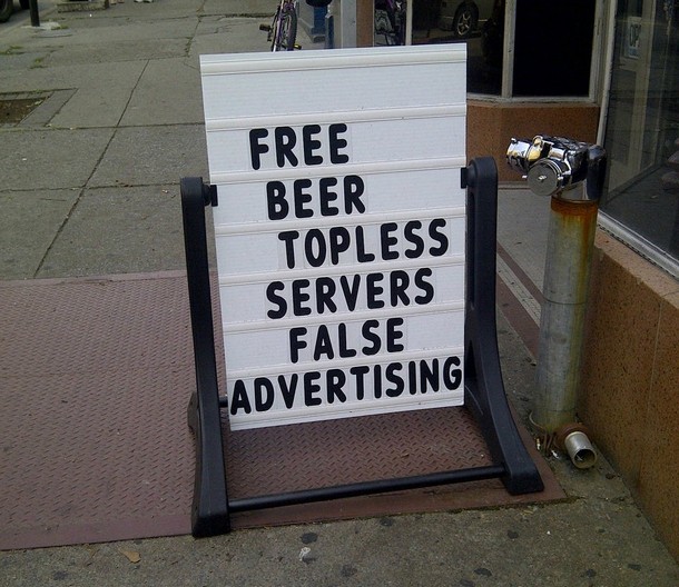
Let’s look at keyword stuffing as an example. This practise became widespread in response to the search engine criteria of measuring page relevance based on how often topical words appeared.
IRL, you wouldn’t blindly trust medical advice from someone who simply says many medicine-related words and name-drops famous scientists. OK, maybe at first you’d listen, then when you find yourself sicker, you’d learn to probe, ask questions, glean context from the next maybe-doctor you meet to see if they really know their stuff and understand your situation well enough to give the right solution.
Search engines soon found their results sick with inappropriate links, thanks to completely irrelevant pages filled with desirable keywords. So they changed the algorithm that determines page ranking. “They” being the key word (lol) here – the search company, not SEO pundits, control the criteria for how pages are perceived by the engine, which is constantly reviewed and updated to reflect a smarter, more human way of making decisions.
Just like how you learn to ignore & avoid advice from quacks, search engines learn too. Keyword stuffing is now not only ineffective, it carries harsh ranking penalties for the offending site. You’ll find similar tales about other black hat and “cheap and quick” style SEO practises like cloaking, hidden text and sneaky redirects.
There is science behind good SEO, but it’s more like a philosophy
So if tailoring tricks for search algorithms is only a temporary fix, how can we achieve sustainably decent SEO rankings? This is where things get philosophical, because search engine algorithms mean to emulate how the human mind deems stuff relevant and desirable.
The world is huge. You could be a beautiful unique snowflake, or generic yet still great value. The same goes for your site, service, product or deal. We can’t control how people see us or how they feel about us, but we can control our output framing us in our best light.
img sauce
This means understanding the ins and outs of who we are and what we offer, and owning how we express this to an intended audience. On the web, it looks like you talking about stuff relevant to you and your business, describing your benefits and advantages in terms your users can understand. And doing so with a tidy version of your natural way of speaking, because this is meaningful to a human audience – and who knows when search engines will learn to filter out a cheesy or sleazy sales pitch the way people already do.
But what do I know? I’m just a nobody with a blog
In my opinion, everyone has the capacity to carry out their own good SEO. The web and search are virtual layers built upon a market made of people. Humans control the demand that websites cater to, with a search engine acting as the friend who understands you and fetches things you may need.

(circa 2012)
Earlier this year, Google added celebrity profiles to search results, based on the knowledge that this is what people typically want when they enter a celebrity name as a search query. This is more than ‘data in, data out’ – the Google engine has considered the real desire for information in circumstances involving real people.
So I believe it’s useful to get well-versed in “knowing thyself” and accurately expressing thyself with respect to the people you wish to connect with. I’m not talking about putting on the hard sell, but exercising self-observation and emotional intelligence, and getting familiar with theory of mind and empathic design. Understanding how you personally respond to sites, design elements, advertising – any sort of stimuli, really – lets you empathise with the people that search algorithms continue to work for.
Of course, this may also turn out to be a temporary fix. Who knows how much longer we’ll be human with the singularity totally on its way. 😛

img sauce
Tl;dr – Be yourself. Don’t cheese out just to hax a search engine cos they can change overnight.


